Friday, 21 March 2014

WIP Feedback

For my WIP peer to peer assessment,  a fellow classmate reviewed my works and gave some honest and useful suggestions and comments that I could really use. His comments were :

Studio 


  • The design issue is clear. Like the set up, it is clever to use these scientific apparatus which kind of symbolises the set up of experimentation. 
  • It is clear enough as the SOI indicated the use of the 5 senses as a design concept. How about sight, touch, hearing and taste? With a combination of two or more senses will be more engaging 
  • Design issue is addressed in a way but maybe a little element of mystery should be added on. Might want to consider to allow the audiences to experiment with the scent distiller which will make them curious on what scent they can produce.
  • Travel journal 1 : Kind of hard to open the pages of the journal, might make a thinner spine.
  • App playboard : Quite lost because it looks like an info graphics and quite confusing, might want to create a video on how the app works
  • Test tube necklace kit : "Go on, be curious" is slanted, fix it.
  • Smell library : Nice to have each bottle with different scent
CPJ

  • CPJ has consistent documentation, many interesting images.
  • CPJ can be more design oriented, nice that it functions like a blog but layout can be changed
  • CPJ is well curated

My feedback for Studio

  • Will explain more on background and the idea of "Made up curiosity"
  • Talk about why smell and sight as main : they trigger memories most and scientifically proven
  • Will emphasise and talk more about curiosity
  • Decide if the distiller will be a "service" or "DIY"
  • Will develop the app to be used and showcased on a smart phone
  • Smell library was yet to experimented with but idea has been settled before WIP
My feedback for CPJ

  • Change blogspot to a domain and design the layout
Actions to be done according to feedback

  • Talk about Cognitive Dissonance : relating experiences with senses
  • Service or DIY?
  • "Be curious, play the role of a chemist"
  • Experience = memories > inspiration = curiosity

I also had a small discussion with my lecturer and the feedback gathered and plans arranged were :

  • Make distiller kit into a "business idea", package it and making it into a kit where it is purchasable and user friendly
  • Make a manual for people to understand and learn to know how to use, assume that users do not understand how a distiller works
  • Make a scent library, test out a few objects and make into a wide range of library with labels of what it is and where to find it


Wednesday, 19 March 2014

Work In Progress Showcase


The layout and display for the WIP showcase, a few items were selected for this showcase. They are basically re-works of some semester one outcomes or the work in progress for this semester. A comment and suggestions sheet was also placed on the table for audience's feedback that might help for the project. Documentation of the project's process are available on the blog and a folder filled with ideas and development through sketches. The app play board is to give audiences a rough idea of how the app works since I do not have the app up and running yet. The distiller, scent library and test tube necklace are supposed to be of the same outcome, however due to space constraint they are not placed in sequence hence all the works do not look like they belong in the same outcome. Outcomes for WIP will also be improved on contents, appearance and art direction wise.


Distiller labels & such


In the process of labelling the apparatus and distiller kit.


The labelling of the scent distiller, scent library and test tube necklace with the usage of graphics and overlays that are in sync with the app since these few apparatus and app is of the same outcome. The graphics and vectors used are also in black and white to fit the art direction and to allow the contents to stand out since they are the "star" of this outcome. The labels should also provide a rough idea of how the distiller kit works, but it can be improved with a manual to indicate the steps of using the distiller so that users can get a clearer idea since they do not have any knowledge and information on how it works.


WIP Showcase Plan


Plans and weekly plans for WIP Showcase, the list of things that I would need to complete by WIP. Step by step, slow and steady.


Sunday, 16 March 2014

Distiller graphic circles


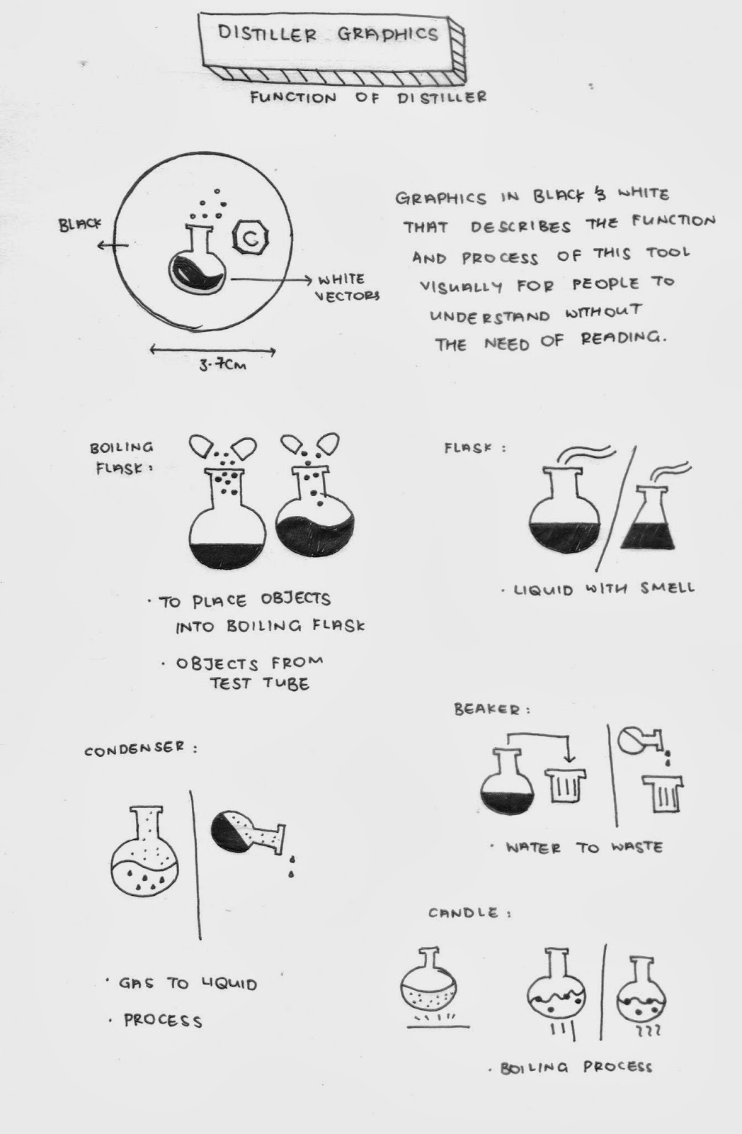
Graphics that will be placed on the distiller that will be in black and white that describes the function and process of this tool visually for people to understand without the need of reading.


A variety and samples of how the graphic sticker can look like, keeping them close to the look of the logo and the overlays on the app.


The final choice of icon designs that will be used for the distiller kit that roughly shows the use or the tool or how the process takes places

1. Place objects collected into boiling flask
2. Water around condenser to waste
3. Boiling process, where the water boils
4. Liquid with smell
5. Liquid evaporating into gas

Distiller logo ideation


I've harboured thoughts about changing the Made Up Curiosity logo by introducing some chemistry elements. Since I will be using some chemistry methods and glasswares for my project, I was thinking of redesigning the Made up curiosity logo with graphics that will give off a clue that it is related to chemistry or the idea of being a chemist at a glance.

These few vectors would be a reference and a start for me to begin on my mind map and ideation. I will be doing up some vectors for the smell distiller machine whereby these logos and graphics will describe the process and function though visuals. There are so many choices that I can't decided on one because the chosen element has to speak loud for the project. I can consider to use for the logo, or even for the design of the distiller to talk about how my final outcome works because they are a few steps to it. Also, I would need to start on this soon because time is running out as assessment is approaching and some of the outcomes in semester 1 used the previous logo. If time is not sufficient, I would prioritise other outcomes.