MADE UP CURIOSITY
Today, I've decided to re-look into the definitions of each words that are the highlight of my project. I wanted to find out if a second look at them will stir new ideas hence I went back to basics. They are Made up and Curiosity.
The other new word which I want to include is Chemistry.
So this is how I found the common areas they share and how they can link to each another. Hence I came up with some equations that can make it better to understand.
Curiosity : A quality related to inquisitive thinking such as exploration, investigation and learning.
A behaviour caused by emotion of curiosity, thirst for knowledge.
A major driving force behind scientific research.
Made up : Having being fabricated / invented
Chemistry : Any or all of the elements that make up something
Chemical substances - Chemical characteristics
Characteristics - Personalities
Chemistry = Made up : A mixture of substances that will make one curious about what they will achieve. Eg : In chemistry class, we are also curious about what we are going to end up with
Also involving my hypothesis which is the usage of the five senses :
Curiosity + Five senses : Using the 5 senses to enhance one's curiosity
Chemistry apparatus : Art direction

Thursday, 19 December 2013
Inspirideas
Random lifestyle objects that provides so many random ideas. All steering towards the idea of curiosity and the usage of glass/plastic that are transparent. Threw in random words and thoughts that came into my head while collecting these visuals.

Light bulb : Ideas, I've got an idea, lighting up
Light up your curiosity


Light bulb x Glass jar
Jar consist of things, things that makes people curious
Transparent
Allow people to see through the things inside


An idea that I find it brilliant, it combines both the elements of light and glass. Almost an idea like, e.g : My curiosity lighted up after being curious about the things inside


The last idea I have which is to Grow your curiosity! / Plant your curiosity!
This above image is inspiring and suitable as it uses a chemical flask to plant.
I am hoping in the next semester, I can take on another approach to make my project more interactive and fun, not so strict and not so "educational". I am hoping to drive it towards the idea of
- Getting out of the design solution idea
- Being curious / enhance curiosity in general
- Create situations that makes people curious
Tuesday, 10 December 2013
Semester One Assesment
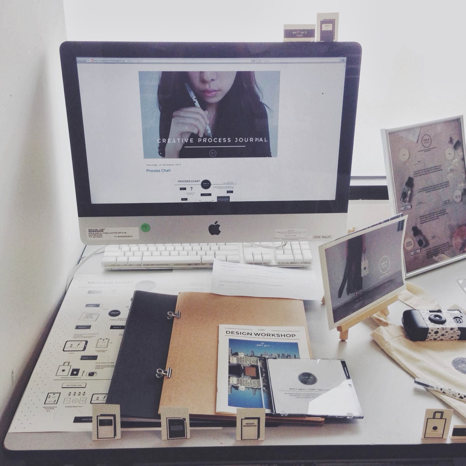


The final layout of all my works for semester one during assessment. It was a little too over crowding on the table but I think each and every piece of work lying there has a message to send and were necessary. I am quite contented with the final outcome, however I wish I can do better for the next semester. And perhaps, if possible change the branding and whole look of the project as they does not really look like a whole set as of now.
For assessment feedback they were as such :
- Improve on the proficiency of software skills
- Contextualize the experiments in order to produce a range of potential and more relevant solutions
- Craftsmanship : greater attention to detail and sensitivity in production and presentation
- Critical thinking : greater degree of analysis and reflection with regards to appropriateness in design decisions
- CPJ : consider designing to curate unique and creative work process
Wednesday, 4 December 2013
"Pass it on"

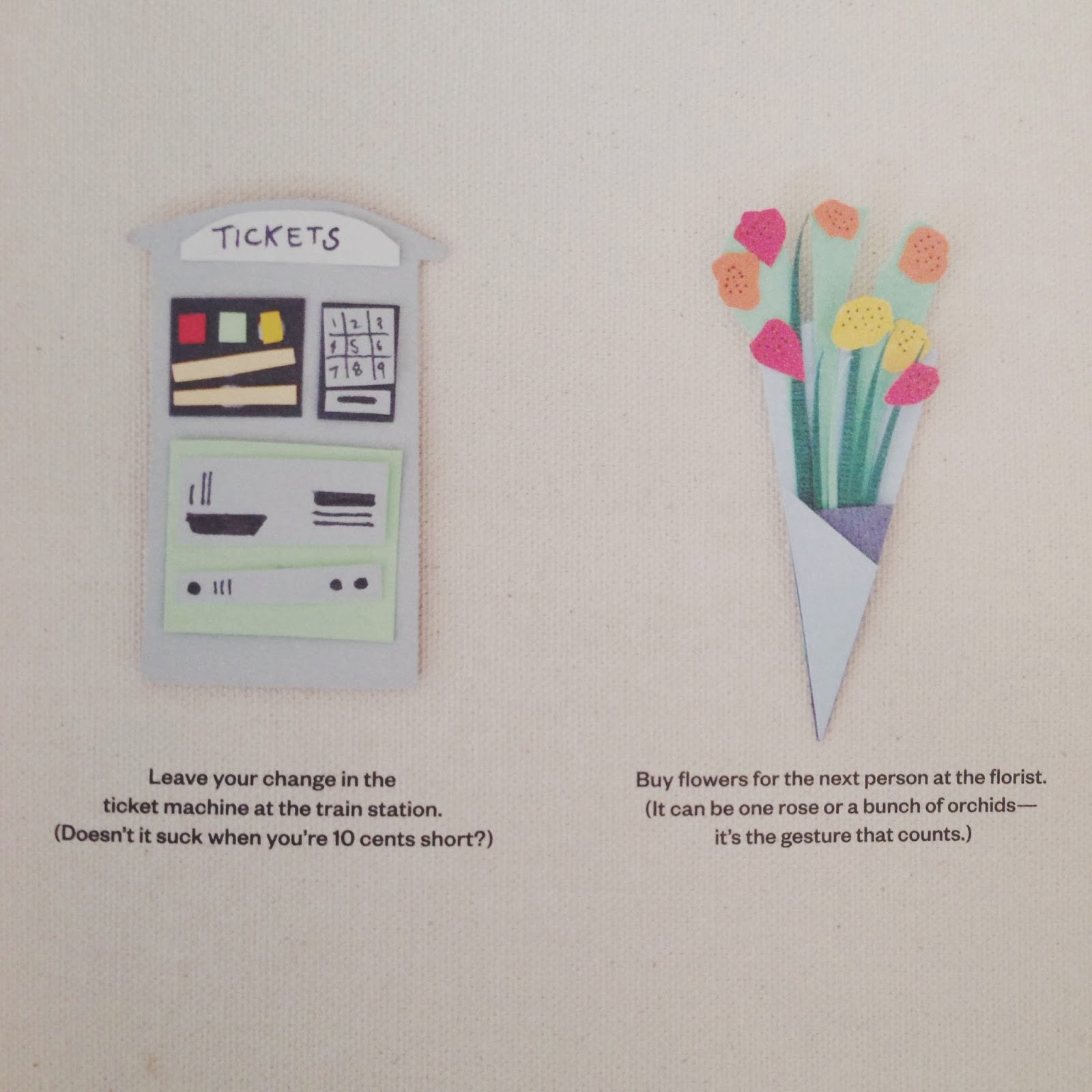

Chanced upon something nice in a magazine on my first day of work for the monocle pop-up store. Not just that the illustrations were interesting because they were actually paper cutting montage, the contents caught my attention. It was about doing something nice for others that just requires a little of some one and all this small gestures can do big things for others. Which I thought all the suggestions will work and I was just pondering how wonderful it would if my project was about kindness. Kindness is not directly linked to my curiosity project, but I guess I can extract a little bit of this awesome project and consider to use it for one of my outcomes in future or even for a self project. Now, pass this on!
Saturday, 30 November 2013
Kentaro Shihaku
After chancing upon a work that I really adore in Japan and also learning about the designer Kentaro Shihaku, I went to find out more about him and his works. And I have to say that I am greatly inspired by his works and in a way they drive me to work harder.
I found out that Kentaro Shihaku is born in Sendai, Japan in 1975 / studied in Tokyo and Rome and he is a creative director / copywriter/ conceptor. His works always give the feeling that makes your heart warm up and greatly influenced by the japanese design style. He has quite a number of work achieved over the span of many years. Here are another two projects other than the Aromalize Project which I totally adore and look up to.
Aromamora
Aromamora is the line of original blended essential oils started from November 2008. Our innovative design combines the functions of a bottle cap and diffuser into one which makes aromamora a lot handy. We have a relationship with not only domestic retails but also Droog, Amsterdam as well. Our products could get huge good reputations and were introduced by both local and global media.


It is just a very simple product but it is ready to use by having the cover of the bottle as the scent diffuser. Plus the branding and art direction inspires me a lot as they are a concentrate of the sense of smell and also the usage of chemistry apparatus to draw people's attention. Which is almost like what I am planning to achieve for my semester two works.
Aromamora books
The next project is called the Aromamora book which is sort of link to the above project. "Aromamora books vol1 Tohoku" is a photo book scented by a blend of special aroma oil, and is a collection of 50 photos that captured beautiful memories of Tohoku areas. The photos have been selected from over 500 submissions from people who wanted to share their special memories for the project. The photo book was created in hopes to keep the good memories and times of Tohoku.
Each photo has a message from the person who took the photo. The book also include a map that shows the location of where each photo was photographed, and a refill bottle of the aroma oil.


after opening the box, Tohoku’s forest scent is immediately coming up

dropping aroma oils when the scent is gone


each photo has a message written by its photographer on the back

50 collected photos, the map and text, 1.5ml-aroma-oil, a smelled coaster, and a pinecone inside
I love the idea of smell + photos + memories, because during my previous research on 5 senses, I found out that smell can trigger a person's memory and that something so small can affect a person's thinking and remembering of a certain period of their life. It also has a pine cone, that also helps people remember a certain place at the sight of it, it is like a resemblance of a place. So I really love the idea of this kit, it has visuals which is one of the main senses which inspires people and at the same time trigger memories. This project is a participatory project and has the usage of sight + smell + touch. It could be a inspiration to kick of one of my project for semester two.
Thursday, 21 November 2013
Process Chart

Final Outcome Presentations
Outcome 1 : A laboratory test on the death of curiosity


A 2 sided instruction sheet that will be placed beside the bottles and experiment kit which people can participate and try out. They will allow participants to know how the curiosity experiment works and also to establish this outcome.

I also framed up the improvised infographic posters so that they will look more prominent and part of the first outcome. A silver frame to go with the chemistry theme and so that the first outcome will have the same art direction.
Outcome 2 : Travel Journal for the curious minded

The final cover design for the travel journal, I kept it simple and the way it is design makes it look more like a journal instead of a normal booklet. Black leather because I want the contents to stand out and not the cover to steal the attention. On the top right corner on the flap of the journal, there is a small label to establish this outcome.

All in all, there are 3 travel journals that will be presented during assessment. 1 : Done in Korea, 2 : Done in Tokyo and 3 : empty. There is a mixture to show how it looks like completed and uncompleted so that the intentions of this outcome will be clear and obvious.
Outcome 3 : Pocket Diary Kit


Process : Pocket Poster


After taking and editing the photographs needed for the pocket poster, I straight away started on the planning and execution of the layouts. Each section talks about different parts of the outcome and the layouts were kept simple and straight forward.

The different try outs of the overlays for the main cover of the open up poster for outcome three.

The establishing shot for this outcome, with a white frame around and a logo at the top. Kept simple so that the focus is on the items for the pocket diary kit. Also, the photograph has already been framed so it is not necessary to add too much graphics or text into this picture.

I also played with the idea of overlaying white text on the specially planned and picked photographs so that they blend it together but at the same time balance out.

Pocket Poster + Pocket Diary


The redesign of the pocket diary and finally completed according to how it was planned. With a black flap at the front to show what this booklet was about and having a inner cover that has vector prints which is also on the pen and camera to make it look like they are from the same kit.

The main cover of the open up pocket poster which has a picture that suggest going on a curious adventure with the pocket diary kit.

When the next flap is opened up, the four boxes talks about the description and use of the disposable camera and pocket diary. While the bottom boxes highlights the importance of the five senses, the hypothesis and the uploading onto a social platform.

To give a better understanding of the design issue and the purpose of this outcome, the other flaps talks briefly about the design issue and the combination of the camera + five senses + curiosity.

The flip side of the poster, which is an establishing shot that shows the items that are contained in the bag, with the logo on the top.


The main purpose of this open flap poster is to show images of how this outcome works and also let the visuals speak for itself. Not forgetting some short description to support the intentions of the outcome and how to go about using it.
Subscribe to:
Posts (Atom)